Playing with toy moneyIf a child tried to pay for lollies at a tuck shop with notes from the Monopoly board game, the shop staff would know instantly that it was fake money... Yet in today’s society, we commonly accept and take for granted the polymer banknotes which we use every day as “money”. They are both just pieces of paper, so what’s the difference? They are both forms of currency, but accepted under entirely different circumstances. Paper money today, whether it be Australian Dollars or Zimbabwe Dollars are deemed valuable, only if the population believes it should represent value. We still believe a $50 Australian dollar note is worth $50 dollars – because that’s what the note tells us. However, we are aware that a $50 note today doesn’t buy as much as it did 10 years ago. Despite the knowledge that inflation is eating away at our purchasing power, we continue to be loyal to our currency. One day this will change, and it will be just monetary history repeating .
Fake (Fiat) vs Real MoneyPart of the money problem today is that the definition of money has changed over the generations. Few people alive today were alive in the 1920s or 1930s when coins actually had silver in them, where your savings in the bank held its purchasing power, because our money was linked to gold. 100 Years ago, gold and silver were referred to as money, as it was the lifeblood to the monetary system. Today gold and silver are.... gold and silver, and banknotes and circulating coins are referred to as money. Another way to put it, gold and silver has and always will be real money, as it is a finite resource, while banknotes and circulating coins are merely currency. Currency is not money! It’s a fake, and more and more people will realise this over the coming decade as inflation dilutes our currency, while at the same time, increasing the value of real money (gold and silver).
Banknotes used to represent valueHistorically banknotes were merely receipts for “real” money, that is, gold and silver. If you deposit 1 ounce of gold, you got a banknote (a receipt) which said it was redeemable for the amount written on it. In the US, its Constitution was written to include , that
"No State shall...make any Thing but gold and silver Coin a Tender in Payment of Debts." Therefore, up until 1933, US banknotes held the words “Redeemable in gold on demand at the United States Treasury”. (confirming the role of the banknote as a receipt). In the Australian Constitution, Section 115 establishes the same principle, that
“a state shall not coin money, nor make anything but gold or silver coin a legal tender in the payment of debts”.
The Constitution is our legal and political rule book (in this instance in Australia, Section 115 is the rule for monetary policy), but despite this, in 1971 the principle of backing a currency with real money was removed, when President Nixon removed the gold window for US Dollars, thus making the US Dollar and all other currencies in the world completely fiat (money declared by a government to be legal tender). In other words, between 1946 and 1971, any nation could hand in their US Dollars (receipts) and buy gold from the US for US$35 dollars a troy ounce.
Because the US printed extra dollars to pay for a negative trade balance and increasing inflation, other countries (particularly France, Switzerland and Great Britain) began to convert/redeem their US Dollar reserves with US gold. Thus the US had no choice but to abandon the system in order to preserve its gold. However, following this change, the US Dollar remained the world reserve currency, despite there no longer a requirement to link the Dollar to gold. Thus an endless money tree was born – and now around 70 per cent of the world’s currencies are denominated in US Dollars (with half of these Dollars residing outside the US).
Private bankers control our monetary system – not GovernmentsAfter explaining this brief history, there is one critical element which has not been covered. Since 1913, the Federal Reserve has been responsible for issuing currency in the United States. The Federal Reserve is a non-Government, private corporation which has private shareholders. It was established by private European bankers from families such as the
Rothchilds, and
Warburgs. These private banking families still remain shareholders of the US Federal Reserve, and thus have direct control over world monetary policy – through the US Dollar, and through the debt based Fractional Reserve Banking system. If the US Government can issue bonds, why does it need a private banking consortium to issue currency for the people? (I will go into greater depth another time).
Likewise in Australia, Australia’s banknotes and coins are issued in the same was that US Dollars are issued in the United States. For one year in 1910, Australia’s notes and coins (Pounds) were controlled by the people, under the Treasury Department. By 1911, the Commonwealth Bank was given powers to issue banknotes (however this was not made law until 14 December 1920 through the Notes Issue Board), and given central banking powers in 1945. The convertibility of Australian banknotes into gold effectively ended during World War I. In 1959, the central banking powers held by the Commonwealth Bank were transferred to the new Reserve Bank of Australia (RBA). Like the recently created Future Fund, the RBA is not a Government Department, but an independent statutory authority. Essentially the RBA make decisions on monetary policy (how much money (or inflation) to print) – just like the Federal Reserve has the power to influence the US Dollar (and economy through interest rates) in anyway it sees fit.
So why do we have confidence in paper money such as Australian Dollars today? Why do we allow bankers to control our money (by inflating it continually year in year out, largely through fractional reserve banking). Aren’t we just using Monopoly (Central Bank controlled) money?
So now that we know Australia no longer backs its Dollars with gold, what has the RBA done with our gold?
The Australian Government sold "our" goldIn early 1997 the Reserve Bank of Australia held nearly 250 tonnes of gold bullion reserves. By July 1997, the RBA
sold 167 tonnes, reducing its holdings from 247 to 80 tonnes (selling some 6 million troy ounces). That 167 tonnes of sold gold is now worth an extra US$4.2 billion more 12 yrs later. What will it be worth in 10 years time? More importantly, what sort of purchasing power will that gold have in 10 years time (remember, there is a huge difference between price and purchasing power!) It’s ok for the RBA to make such a mistake though?
The RBA, the bankers, sold
our gold (our money) near the bottom of the commodity cycle so it could leverage its balance sheet to speculate in fake money (currencies).
It’s even in the
RBA’s charter that:
'It is the duty of the Reserve Bank Board, within the limits of its powers, to ensure that the monetary and banking policy of the Bank is directed to the greatest advantage of the people of Australia and that the powers of the Bank ... are exercised in such a manner as, in the opinion of the Reserve Bank Board, will best contribute to:
(a) the stability of the currency of Australia;
(b) the maintenance of full employment in Australia; and
(c) the economic prosperity and welfare of the people of Australia.'
I would argue that the RBA, and all other central banks around the world are:
A)
Increasing the instability of the currency
B) Creating
fake job opportunities through the current monetary system (eg. How many jobs rely on an inflation society – superannation, sharemarket, house prices inflating. ie. Bankers, accountants, lawyers...)
C)
Decreasing the economic prosperity and welfare of the people of Australia (through the debt-based fractional reserve banking system to ensure businesses and individual become enslaved to the banks)
Anyway, its ok for Australia, we are naturally endowed in gold. We have enough gold in the ground to replenish and to restore to a more sound monetary system in the future – right? Only if our politicians, and everyone else learn basic monetary history. W
e are conditioned at school, amongst other things, to be savers, not investors - to rely on debt to buy “assets”. It is not a coincidence Australia is now a consumption/services economy today (and why we are willing to sell our gold dirt cheap).
Taking this one step further, from a different angle, lets examine what Australia, as a country does with its real and fake money. The great paradox is that Australia is well endowed in both real and fake money. We are a major gold producer/exporter (real money) and a significant producer and innovator of banknotes (fiat money).
1. Fiat MoneyNote Printing Australia (NPA) - a wholly owned subsidiary of the Reserve Bank of Australia, prints the banknotes for Australia, New Zealand and a handful of other countries. In 2008, it exported 182 million (fiat) banknotes.
Securency International – 50 per cent owned by the Reserve Bank of Australia, prints the polymer substrate for banknotes which is used by 27 countries around the world. In 2008, it supplied polymer substrate to 13 countries. The company now has substrate manufacturing plants in Mexico to supply Latin America.
Both NPA and Securency achieved similar profits in 2008 to 2007.
So it appears Australia has been a world leader in the evolution of currencies, and has done modestly out of exporting banknotes (receipts) and banknote technology.
Let's compare to Australia's recent achievements selling real money.
2. Real MoneyLets now examine Australia’s production and export of real money – specifically gold.
For anyone who may not be aware, Australia and the world is currently experiencing a major bull market in gold and silver. With the explosion of Government and private debt, it is inevitable that more and more people will flock to real money, as opposed to printed money. We are currently halfway through a normal commodities cycle (which started in 1999). I feel this will be no ordinary cycle,but a once in a lifetime opportunity for a large wealth transfer to those who hold real money (particularly silver).
Until more recently, Australia, like South Africa, has had declining gold production for the past couple of decades. China became the world’s largest gold producer in 2007, but Australia should resume number 2 spot in 2009. If we compare the Australian Government’s view of gold to that of China, we get two completely different views. Australia is short-sighted, we see gold as a commodity export earner only, to fuel our consumption/services economy. On the other hand, the Chinese central Government is slowly accumulating gold and is buying most of its domestic production (oddly enough, an Australian company, Sino Gold is China’s largest gold producer). China is about to overtake India as the world’s largest buyer of gold.
Recent trade statistics supports this view. In 2008, Australia exported $14.3 billion worth of gold (up 27% on 2007), of which nearly 40 per cent was exported to India. Australia is also a major importer of gold, importing nearly $9.7 billion (up 59% on 2007), reflecting Australia’s niche capability in refining
gold dore’ bars. Most of this gold is then re-exported.
This then leads into:
AGR Matthey. This company (40% owned by the Perth Mint) refines about 60 percent of Australia’s annual mined gold. AGR Matthey refines the dore bars into 99.9% gold bars.
Now, the most interesting part of this post.
The Perth Mint - is one of only about six bullion mints in the world (partly owned by WA Govt). It is a top 50 export earner for Australia, with over 90% of its products exported overseas. It is Australia’s largest gold refiner (under the name Gold Corporation) and refines about 60 per cent of Australia’s annual gold production.
The Perth Mint recently released its
annual report for 2008-09.
The growth in volume and profit is quite staggering for only one year. The Perth Mint is selling real money to the world, and making very handsome currency profits.
- A
ten fold pre-tax profit increase to $38 million (up from original forecast of $4.9 million).
- Sales of coins, bars and medallions up
50 percent to 2.7 million units.
What I find most interesting is the growth in metal volumes. Here are my calculations based on their recent annual reports.
Graph 1: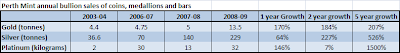
To me,
silver is the clear stand out in growth.
Analysing further:
- Averaging
100% volume growth per annum over the last 5 years.
- The 229 tonnes of silver produced in 2008-09 equates to
7.36 million troy ounces of silver (vs. 4.5 million in 2007-08).
- Excluding the last couple of years of silver product production, 229 tonnes is
more than all the Perth Mint silver coin production for a 20 year period from 1987.
Clearly silver is exploding in growth, but only about 1 in 100 people would know this. But why?
Silver's price is biscuits compared to gold, and yet silver is 4 to 5 times rarer in gold today! This is because silver is still heavily manipulated by two US based banks on the NY COMEX exchange. No other investment opportunity I have studied comes close to the potential of silver. This may seem uncharacteristic to overstate such a claim, but do not take my word, study and draw your own conclusions. To determine if gold and silver are going to be good long-term investments will largely depend on your 10-20 year outlook for the world economy and for inflation. It's better to do a bit of study than to put it into the too hard box. I believe big inflation, political and social instability is almost all but inevitable because the current debt-based monetary system is broken. It’s just monetary history repeating. All past fiat currencies have collapsed to their true value - zero. There are times when fiat currencies, and debt are king (post WWII to 1999), and there are periods when real money is king, and is the only form of accepted money (other than barter). Don’t take my word for it. Like any investment, it is important we do our own due diligence. We must embrace individualism and always look outside the box (tv screen).
This post is starting to hit the crux to the reasoning behind why I first set up this blog. Understanding basic monetary history and having an awareness of current monetary events are vital if we are to shed some light on where the world economy is heading to in the next decade.
Best,
Scott
Concluding thought:
A few weeks ago I visited the Perth Mint, and one thing I found most intriguing is that it’s large gold bar collection is owned by N M Rothschild & Sons (of London). The same, famous banking dynasty which set-up the first central bank, the Bank of England, and later the Federal Reserve in the US. More on central banking soon...
 The rise or fall of the All Ords is largely attributed to the big 4 Australian Banks and BHP. The big four banks account for 21.47% of the All Ords, while BHP accounts for 10.15%. If you compare the chart below (Financials Index) with chart 1, they are a mirror image of each other.
 No other area in the Australian economy has done as well as the Big 4 Australian Banks. They now have combined market capitalisations which exceed the pre-GFC crash. Through help of the Government, they have increased their monopolistic position in lending. For reasons unknown, the Australian Government and ACCC allowed Westpac to buy St George Bank (no. 5 bank), and Commonwealth Bank to buy BankWest. In early September 2009, the Australian Prudential Regulation Authority figures reported that the big four lenders captured almost 100 percent of the $7 billion in new mortgages written in July 2009, squeezing the small lenders out of the mortgage market. Before last year's funding freeze in global markets, the big four banks' share of new mortgages was running at about 60 per cent. Some day soon, just like in the US, we will be having the “too big to fail” debate in Australia. The Australian banks are sitting on the mother-of-all housing bubbles, which is staying upright for now due to unprecedented net migration and government stimulus intervention (see further below). Give it a couple of years, the Great Australian Housing Ponzi Scheme will eventually run out of buyers.
  source: Chart of the Day
 source: ABC News, Alan Kohler, 23 Sept 2009
 source: Chart of the Day


.PNG)


