Showing posts with label All Ords. Show all posts

Friday, November 13, 2009

The mother-of-all bounces

Last November I posted on the mother-of-all-crashes Through a couple of graphs I detailed why the Australian and US sharemarkets were falling at a faster rate than the great sharemarket crashes of 1929. After the post, the Aussie market drifted sideways for a few months before falling even lower to below 3100 (March 09), for a total peak to trough fall of 55 per cent.

Now, a year on from that post, we have witnessed, perhaps, the mother-of-all (dead cat?) bounces, in an 8 month period from mid-March 2009 to mid-October 2009, the All Ords has rebounded some 56 per cent from the trough (see chart below).

Chart 1: All Ords - crash and bounce
The rise or fall of the All Ords is largely attributed to the big 4 Australian Banks and BHP. The big four banks account for 21.47% of the All Ords, while BHP accounts for 10.15%. If you compare the chart below (Financials Index) with chart 1, they are a mirror image of each other.

Chart 2: The Big 4 banks led the All Ords crash, and now the recovery. Notice the % fall and % rise similar proportions to Chart 1 (XAO)
No other area in the Australian economy has done as well as the Big 4 Australian Banks. They now have combined market capitalisations which exceed the pre-GFC crash. Through help of the Government, they have increased their monopolistic position in lending. For reasons unknown, the Australian Government and ACCC allowed Westpac to buy St George Bank (no. 5 bank), and Commonwealth Bank to buy BankWest. In early September 2009, the Australian Prudential Regulation Authority figures reported that the big four lenders captured almost 100 percent of the $7 billion in new mortgages written in July 2009, squeezing the small lenders out of the mortgage market. Before last year's funding freeze in global markets, the big four banks' share of new mortgages was running at about 60 per cent. Some day soon, just like in the US, we will be having the “too big to fail” debate in Australia. The Australian banks are sitting on the mother-of-all housing bubbles, which is staying upright for now due to unprecedented net migration and government stimulus intervention (see further below). Give it a couple of years, the Great Australian Housing Ponzi Scheme will eventually run out of buyers.

Like the Aussie market, most world markets have bounced, including the Dow Jones (US). As the following chart demonstrates the length and magnitude of this bear market bounce is unprecedented when compared to the Great Depression bear market rallies.

Chart 3: Depression-era bear market rallies (Dow Jones)
source: Chart of the Day

The three charts above give us a clue about the state of the world economy (and I would argue, the state of the US-centric monetary system). Extreme volatility is in full swing.

USD-AUD Exchange Rate

No better example of extreme volatility in the system is the USD-AUD exchange rate.

Chart 4: In 16 months the AUD has gone from almost parity with the USD, crashing 39%, and now rebounding 56% from the lows at 60 cents
So what has changed?

Nothing, nothing has changed. The fundamentals are still broken. The US is still trading insolvent and an aging population will ensure most Western Countries will pursue a path of monetisation (going into more debt) to pay for the welfare state. What has changed is two things:

Inflation and Timing


During the GFC we were constantly told of deflation (decreasing prices). However, during this time I argued that inflation was and will remain our greatest concern. In the middle of the GFC (June 08), Australia's money supply growth was at 23 percent (annualised), the highest rate since the mid 1970s. I ask.. is it any wonder that it appears Australia is such a buoyant economy right now? We inflated our way through the GFC. Another angle is that we populated our way through the GFC (see chart below). If you add more citizens to the economy, there is greater demand on food, housing and general consumption. Add Government "free" handouts, and the warm fuzzy experience we feel aobut our "resilient" economy was all-but inevitable. To the contrary, I believe this is making a bad situation worse, at least for the long run. The artificial wealth effect continues.

Chart 5: Inflate and populate out of financial crisis! Australia net migration since 1860. You would think there was a gold rush on...source: ABC News, Alan Kohler, 23 Sept 2009

The other difference at play here is timing. During the GFC, the All Ords, Dow Jones and even world trade (click to see charts) were declining at a faster rate than what they did during the 1929 crash. The rate of fall was just unsustainable. It's the law of the markets... or like bouncing a tennis ball. If you bounce it hard on the ground, its going to bounce back to some extend. In market terms, this is called a dead cat bounce (however some stocks fall and just don't bounce...). Timing is everything. For instance BHP was almost $50 per share prior to the GFC crash, than fell to $21 seven months later. Same company, and arguably the fundamentals of BHP were stronger than ever. The difference is market mood. Perceptions of value change over time.

Dow-Gold Ratio still falling

One of the key indicators I keep an eye on is the gold-dow ratio. When we price the world sharemarkets against gold, the downward trend is still well intact. Historically the Dow-Gold Ratio goes to below 1 when gold becomes very expensive relative to the sharemarket (Dow). There is still a long way to go... Gold is very cheap at US$1,100 oz!

Chart 6: What bounce?
source: Chart of the Day

Money can be made in all market conditions. Volatility in the markets in the last two years is telling us something is happening. Short-term it may appear that everything is back to normal. This couldn't be further from the truth. Measuring the share market and housing markets (and other debt-based markets) in terms of a tangible good (ie. gold) tells a very clear non-volatile storey. The long-term fundamentals have not changed, but arguably getting worse year by year, as Government and banks continue to fuel the fire with more fuel (inflation).

Cheers
Scott

(feel free to comment!)

Tuesday, April 14, 2009

Bull bounce in bear market

The Australian sharemarket is up almost 20 percent from the lows made just over a month ago chart. We've had a bull move in a bear market. More often then not referred to as a Bear Trap. Many market commentators are asking if this is the bottom? Whether it’s the bottom or not is trivial. Traders can make just as much money in a falling market than one which is rising. We should be more concerned about the fundamentals of the world economy. The structural problems of the broken world monetary system and the solvency of the United States and other countries.

Chart 1: The All Ords is up around 20 percent in the last month.

Chart 2: Longer-term, the 200 moving daily average provides a major resistance point.

Predictions

Short-term: If the All Ords can hold and stay above 3700, it will likely then push over 3900. Most likely, the All Ords will push back towards 3300 and resume its sideways channel.

Longer term: Expect the All Ords to push sub-3000 as the world economy slips closer to depression.

Longer-longer term: The printing presses are continuing to run hot and the paper will eventually find its way into the sharemarket (property market, commodities etc).


Some good news

Some of the best moves in the last month have come from the resources sector, in particular, copper companies. On the rocket list include: PNA, ABY, KZL, IVA.

If we examine the latest LME warehouse charts (below), its interesting to note that copper, zinc and lead have all made a plateau (in supply). Could it be that enough mines have closed to bring supply and demand into equilibrium? If so this could continue to be a short-term positive for the sector.

Chart 3:Copper, Lead and Zinc have plateau in stockpiles (for now) while nickel and aluminium are still in oversupply.

Some bad news

Much of the gains in the last month have come from stocks you wouldn't want to be holding in a bear market: the banks, property trusts, and other high debt or high liability companies (eg. RIO, OZL).

[As a rule of them, you need only look at what the top 4 banks, and BHP do on any given day, week or month to find out a general direction for the market. BHP alone makes up around 10 percent of the All Ordinaries Index)].


More bad news

We are now heading into the reporting season in the United States. There will be surprises. White elephants will continue to fall from the sky. Will the US actually let more big companies fail? Will they finally let GM die soon?


Add a little G20

The recent talkfest at the G20 nations meeting should provide little confidence to the world markets. The G20 is a farce. It's made up of debtor nations and printing presses. Their goal is to reinflate the world economy to create the next bubble, to create the next imaginary wealth effect. Instead of making structural adjustments to the monetary system, they think it will be easier to reinflate asset prices at the cost of taxpayers. Their actions will only worsen the current economic situation and intensify the structural problems of the world monetary system.

One of the outcomes of the G20 meeting:
use the additional resources from agreed IMF gold sales for concessional finance for the poorest countries

In otherwords, continue to use IMF as a pawn (much like the World Bank) to provide more loans (debt) to poor nations, so that they remain in debt.

The other key point is that the G20 (particularly led by the US) need to keep the gold price down. A surging gold price threatens the viability of the current monetary system and purchasing power of the world's fiat currencies. The US, UK and many other G20 countries (including Australia) have already sold much of their gold reserve holdings over the last 20 years. The IMF must pull its weight… (the longer they can keep gold price down, the more time there is for private investors to accumulate).

Over $2 Trillion has been pledged by G20 nations in the last year! This does not include any additional 'quantitative easy' (printing money). What will the number be in a years time? (about $5 trillion perhaps..)

See this article on what each G20 nation has committed so far.


The Banks

The following chart visualises what has already happened to to some of the world's largest banks.

Chart 4:
Ausrtalian Banks

In contrast, the Australian banks have held up well, albeit they have fallen less than most banks worldwide and they are still alive and profitable. Indeed, the Australian banks may look tempting to an investor. The sector (XFJ.ax) has risen some 36 percent in the last month as the following chart illustrates.

Chart 5: Our banks are up, but still in a bear trend.
Australia's top four banks are now amongst the largest in the world. In late January 2009, the Australian reported that the big four were now in the top 20 banks world wide by market cap.

Westpac - 9th, worth of $US28.2 billion ($43.2 billion)
Commonwealth - 15th
NAB - 17th
ANZ - 19th

All four banks are ahead of previous mega-banks: Citigroup (US), Morgan Stanley (US), Barcalays (UK) and Deutsche Bank (Germany). It's almost the last man standing! Something is wrong... very wrong...


Lets say they got lucky

Former RBA Chairman Ian Macfarlane recently stated this about why the Autsralian banks are holding up so well (see the Business Spectator for full article).
the relative health of Australia’s banks is not much a result of their superior management, but pure luck: that they aren’t allowed to take each other over, and they haven’t had enough funds to invest in US sub-prime mortgages and CDOs.

There is probably a lot of truth to this statement. Australia and our banks have been somewhat lucky so far. I feel a lot more nasty surprises to come out in the next couple of years (B&B, Allco, ABC Learning types). The biggest ongoing concern by far is the property market (commercial, industrial and importantly, residential markets).

The Intelligent Investor has a great article which examines the balance sheet of Westpac in 2008 and compares it to 1989 (just before the last recession). Here are some of the key, concerning points.

1) Westpac no longer has any gold bullion
2) Is heavily exposed to the housing market. (54% of all loans in 2008 compared to 25% in 1989)
3) Now has tens of billions in Derivatives

Further:
The result would be devastating if Westpac were to write off 8.9% of its loan book over the next four years, as it did in the four financial years from 1990 to 1993 (see Table 3). Taking 8.9% of Westpac’s $313.5bn of loans and acceptances as at 30 September 2008 would imply $27.9bn of provisions.
Something smells funny

We can’t say categorically that Australia’s banks are making grave errors in their risk modelling. But we can say that something smells funny when the most a bank thinks it can lose on a $145bn mortgage portfolio in stress is $201m, or 0.14% of the portfolio. In fact, it sounds eerily similar to the thinking in North America before its real estate collapse.

At the least, it’s sensible to countenance the possibility that the banks have underestimated the risks, or perhaps the correlation of certain economic and financial factors under extreme scenarios. That being the case, the recent rally in bank stocks may provide a great opportunity to revisit your portfolio’s weighting in this sector.
Yes, I think Australia has been somewhat lucky so far, but its now starting to set in as the newspaper fill their front pages with job loss reports. Today it was Qantas (1,750 jobs gone). Just wait till the papers start reporting daily on the housing (price) crisis.

Cheers
Scott

Saturday, February 7, 2009

Bubbles Burst

Bubbles

Today I examine market/financial bubbles.

Wikipedia's definition of an financial bubble:
"An economic bubble (sometimes referred to as a speculative bubble, a market bubble, a price bubble, a financial bubble, or a speculative mania) is “trade in high volumes at prices that are considerably at variance with intrinsic values”
Bubbles vary in length and magnitude.

Market psychology on the way up:


- Excitement
- High expectations
- Hype
- Speculation
- Market sentiment (mood) often bullish.
- Sector sentiment often very bullish.

Mark psychology on the way down:

- Reality sets in
- Actions (of managers) speak louder then words
- Deadlines not met
- Cost overruns
- Market sentiment may be bearish.
- Sector sentiment may be very bearish.

My interpretation of bubbles:

i) A lot of bubbles start with a strong breakout of resistance, which then sets into a long up (bull) trend.
ii) The peak is usually brief - with little consolidation.
iii) Support is broken at the top and a strong down (bear) trend sets in which gains momentum.
iv) The bubble more often then not goes back to the pre-bubble resistance line (now support line).

Technical Analysis of sharemarket bubbles

The following is another perspective on the Australian All Ordinaries chart applying my interpretation of a bubble.

Chart 1: The All Ords bubble has burst back to the pre-boom levels.
The bull market lasted around 44 months, while its taken only around 13 months to deflate. This illustrates that as soon as the All Ords hit a technical bear market in January 2008, the sellers flooded the market and sold out of holdings at almost any price.

Shares which Bubble:

There are countless examples on the Australian stockmarket (and indeed any financial market) of bubbles which have burst back to pre-bubble levels. Each bubble is unique in magnitude and length.

To show this, lets have a look at Compass Resources (CMR.ax) and Minemakers (MAK.ax).

Some bubbles have an equal inflation and deflation, such as Compass Resources.

Last week Compass fell into administration. The company had potential to be a significant lead/zinc producer with operations in the Northern Territory. The company was one of the best performing stocks in 2006, its now in the worst performing stocks for 2009, having essentially reached zero shareholder value.

Chart 2: Compass Resources. Its bubble had a more equilateral rise and fall.

Other bubbles have rocket-like momentum on the way up, with a longer decline when the bubble pops.

Chart 3: Minemakers - phosphate bubble
Minemakers had an extremely volatile 2008. It went up an astonishing 700% in only three and a half months, then took 7 months to fall back to the 45 cent region. A big bubble inside the space of one year.


Commodities Bubbles:

The following charts show bubbles which have burst in some of the main commodities (both metals and food). Each chart is measured in $USD and is over a 25 year period. (these charts are sourced from IndexMundi

Chart 4: Copper

Chart 5: Zinc

Chart 6: Wheat

Is it a bubble? Depends on your measuring stick:

All the above charts, have been measured in terms of fiat currencies, that is, the Australian Dollar or the US Dollar.

Could it be that the extreme volatility in sharemarkets, property, commodities etc in recent years has been largely attributed to the world monetary system?

If you measure a tangible good vs another tangible good (say gold vs crude oil), price will always go sideways over time (from oversold to undersold and back again). In other words you have one finite resource vs another finite resource. Supply and demand determine price.

However measuring price with fiat currencies we have a situation where the money supply is expanding at an exponential rate (see my article on money supply >here<). We need more and more money to buy the same amount of gold or barrels of oil. This is inflation and the devaluation of currency. Since 1971, when President Nixon closed the Dollar link to gold, the US money supply (based on M3) has increased by over 1300 percent. A 13 fold increase in 37 years. This is the main cause of the big bubbles in recent years, and the subsequent deflationary pressures causing most to burst to pre-bubble levels. (The Australian Dollar has lost around the same amount of purchasing power since 1971).

To demonstrate the difference between fiat-based bubbles and measuring a tangible vs. tangible, lets look at Crude oil, first against the US Dollar, then crude oil vs gold.

Chart 7: Crude Oil in $USD terms - Nothing has fallen harder then oil in the last year.

Chart 8: Crude Oil in Gold terms (both using USD as Index). Also known as the gold-oil ratio.

Chart 9: Was there a bubble and crash in oil? Not when measured against gold.
If you compare this chart to the USD measured crude oil chart, the spike when oil went to $147 is shown by a small movt against gold. Indeed oil was outside the trend and expensive against gold. You only needed around 6 barrels of oil to buy 1 ounce of gold. Conversely, as oil crashed below $40 USD in late 2008 (and Gold recovered slightly in USD), oil in terms of gold moved back up its trading range, making gold look more expensive and now requires around 20 barrels of oil to buy one ounce of gold.

So where is the bubble and the crash?

* There is much less extreme volatility if you measure tangible goods vs other tangible goods *

Conclusions:

- Since 1999 there was a major change in the tide. We moved from a financial (debt) cycle to a commodities cycle (we are halfway through an average commodities cycle).
- This has caused extreme volatility and uncertainty in pricing of financial assets (sharemarket, property).
- Financial assets are now facing deflation. In other words, debts are being revalued and re-risked.
- Meanwhile tangibles (when priced against one another) continue to move between overvalued and undervalued. Very few bubbles are formed. Value will always go sideways over time under this measuring stick.
- Bubbles have been dramatic only in terms of fiat based currencies.
- Future financial bubbles will be even more volatilie and even more inflationary on the way up.
- Be weary of charts which go rise too quickly. A vertical movement must find a new level of support at the top.
- The peak point is the key. If it cannot hold the peak levels, expect a strong downward movement from the top.
- The Australian sharemarket bubble has broken, but this will not stop it from going lower.
- The next big financial bubble to burst is Australian housing.
- Government's and central banks will do whatever they can to keep "prices" artificially high rather then let financial debts burst.
- They will do this at the cost of the fiat based monetary system. (Hyperinflation bubbles should be seen by 2020).

Cheers
Scott

Thursday, January 22, 2009

British Financial Crisis deepens, All Ords to follow bear trap!?

British Financial Crisis Deepens

Royal Bank of Scotland

The UK financial system took another huge blow earlier this week with the Royal Bank of Scotland announcing it will post the largest financial loss in British history with 2008 losses expected to be around £28 billion. As result of the announcement Royal Bank of Scotland closed down 67% on Monday. As the chart shows, strong sell signs were present a a good 18 months ago.

Chart 1: Royal Bank of Scotland - the chart says stay away!

Instead of letting RBOS and insolvenet firms fail, the British Government has tried a new wave of reforms. More Government intervention will not fix the crisis. It hasn't worked yet and it won't work going forward - it's only going to add fuel to the fire!

The British Government has now:
- Offered banks to take up government insurance against their expected bad debts
- will increase its stake in Royal Bank of Scotland o nearly 70% from 58%.
- The Bank of England will be able to buy up to £50bn worth of assets in companies in all sectors of the economy.
- Allowed Northern Rock extra time to repay its loans from the government

The otther remaining big banks are also falling as a consequence of RBoS announcement. Barclays is down over 30 percent and Lloyds is down over 50 percent so far this week. Total nationalization of the whole banking system is all but guaranteed in the UK. (Don't think it won't and can't happen in Australia someday soon....)

Pound Sterling plummets

Meanwhile the Pound Sterling is free falling against other major world currencies. It is now at its lowest level against the US dollar since September 1985, and heading towards parity with the Euro. This is the economic consequences of a faltering economy.

Measuring the loss of purchasing power in Pound Sterling vs other fiat currencies is really a side issue. All fiat currencies continue to loose their purchasing power towards their true value - zero.

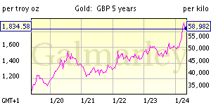
Chart 2: Gold measured in £Pounds is showing some strong price movement once agian.

All Ordinaries Index

Back in Australia, the All Ordinaries index is showing another bear trap setup! The recent sideways movement is looking very similar to the previous pauses in this bear market.

The market fundamentals are not improving. The financial crisis is becoming more noticeable in Australia these days with recent high profile job losses by large companies such as BHP, Rio Tinto, David Jones. Companies continue to scramble for equity injections to reduce exposure to debt. Market conditions are not healthy... Proceed with caution.

Chart 3: All Ordinaries - January 2009

2009 Outlook Videos

I thought it would be worthwhile to put up some more recent videos on some of the commentators I follow.

James Turk: Key "Factors That Will Drive Precious Metals' Bull Market" (1 of 5)


Micheal Maloney: Predictions 2009 (1 of 5)


David Morgan: Predictions 2009 (1 of 2)


Peter Schiff predictions for 2009


and


Peter Schiff & Steven Keen on Dateline Sept 2008 (1 of 2)


Cheers
Scott

Monday, November 24, 2008

Measuring the market meltdown so far…

Measuring the market meltdown so far…

It's been a little over year since the All Ordinaries hit its highest point of 6873 on 1 November 2007. On Friday 21 November 2008 it hit a low of 3201 – a fall of 53 percent.

Chart 1 shows the All Ordinaries (the main index for the Australian Sharemarket XAO.ax) in the last 18 months. The earliest and strongest signal that we were entering a bear market was back in January 2008. Since January, the market has tried to find a bottom. After falling, only 2 possible outcomes are possible - i) pause and go sideways ii) Go UP. On each occasion, the XAO paused, then broke support (the green cross), in the search for a new bottom. A bottom has still not been made!

Chart 1: All Ords in last 18 months
As the following chart 2 shows the current financial bear market is rivaling the 1929 crash in speed and depth, so far. With the 1929 crash, heavy losses came straight away, whereas the current bear market had a small correction before it started in August 2007, then a decent crash in Dec-January 2008, then in July-August-September. If we are to follow 1929 from here, there is still some pain to come before the bottom. The current bear market is already worse then the early 1970s (first oil shock) and the Dot Com crash.

Chart 2: Alan Kohler, ABC News 24 Nov 2008
* Note however, that after the initial crash in 1929, from November to January of 1930 the US sharemarket rebounded some 50%, before resuming its major bear market. December-January periods tend to be good months for the sharemarket historically, but not always so (like last Dec-Jan).

Chart 3: in The Financial Review 24 Nov 2008
Chart 3 compares all the bear markets in the 1900s showing the mean percent decline and magnitude (over days). This chart shows that it is comparitable with 1901, 1906, 1919, 1937, and 1973 - but the duration of the current bear market is much much shorter to reach this decline. Only 1929 stands out. Could the ultimate bottom be somewhere near 1929...? and in what time frame?

Comparing the meltdown in terms of Gold and Silver

In the last year the All Ords has gone down some 53 percent measured in terms of Australian Dollars (the stock are measured in $AUD p/share). When you measure the All Ords in terms of gold or silver though(or any other commodity such as wheat, oil or other tangable no-liability (no debt) asset), you will see that the sharemarket has been crashing for several years, going back to the Dot com days. In 1999, 1 point of the Dow Jones could buy you 45 ounces of gold. Today 1 point of the Dow Jones can buy you around 9.5 ounces of gold. In these terms, the Dow has crashed by over 72 percent so far. A similar picture is happening to the housing market in the US (and in Australia), which I will touch on in a future post.

To measure the All Ords, I merely used historical year end gold/silver data (in tons) with year end All Ords data. The charts speak for themselves.

The unique qualities of gold and silver is that it accounts for all the debt and money created throughout time. When sharemarkets, real estate and credit markets bubble, people flock to undervalued gold and silver.

Chart 4: Gold vs All Ords
Notice in the 1970s and early 1980s, gold quickly fell to its overvalued region. Then the sharemarket became undervalued. The All Ords peaked in 1999 (same as Dow Jones) in terms of gold.

Chart 5: Silver vs All Ords
Like gold, silver did the monetary accounting in the 1970s and early 1980s, however today is a very different picture. Silver is extremely out whack and very undervalued compared to gold in Chart 4. The All Ords looks very expensive in terms of silver.

Eventually gold and silver will go back to the expensive levels at the bottom of the charts - but there is some way to go yet!

More good stories to come on gold (and particularly) silver...

Commonwealth Bank now has larger market capitalisation than Citibank

Last Friday, as one market commentator pointed out, with the falling shareprice of Citibank below US$5 per share, the market capitalisation of the Commonwealth Bank (CBA.ax) is now larger then Citibank, once one of the world's largest banks, and still huge in terms of Tier 1 capital and revenue.

Shareholders are now betting the bank will be bailed out by the US Government and that equity holders would be wiped out. As I write this, there are news clips coming out saying the US Government will guarantee close to $US300 billion ($475.3 billion) of Citigroup's assets with an additional an additional $US20 billion in capital to help it stay alive (for now). **insert more fuel to the world economic fire**

Still to come: Housing bubble in Australia, and my thoughts on Obama's Presidential win (in an world economic/monetary viewpoint).

Cheers,
Scott

Tuesday, October 14, 2008

Boiling Frog Syndrome

Boiling Frog Syndrome

Ted Butler of www.investmentrarities.com summed the current situation up best.

People do not appreciate the current economic events, because every day there is more and more bad news. We start to tune out of it after a couple of banks go under. It starts to feel normal (or common). People also just do not like to hear bad news. It's a bit like hearing terrible war stories from Iraq or Afghanistan. We do no truly appreciate the true seriousness of events over time, only if it personally affects us.

If you put a frog into a pot of cold water and increase the heat gradually to a boil, he won’t jump out.

The heat is on the world economy and now is the time to wake up. Don't wait for the water to reach boiling point. Major banks and insurance companies which go back to the mid 1800s do not suddenly go bankrupt for no good reason.

(Ted's boiling frog explanation was originally in relation to a retail shortage in the silver market. I have yet to find time to discuss the opportunity in silver on my blog, but right now there is a 10 week wait to take delivery of any silver in Australia. There is a worldwide shortage, yet the price of silver is still low because of market manipulation by a couple of US Banks. More to come on this subject..)

To avoid the boiling frog syndrome you must have i) an open mind, ii) change your context and iii) take action.


Last week in Review:

U.K. Trillion Dollar Bailout


Last Wednesday 8 October 2008, the UK government announced a £400bn bank rescue package to help increase bank capital and sure up loan guarantees.

The chart below puts some perspective on the bailout plan:

Six central banks cut rates

Also on Wednesday, six central banks cut interest rates by half a percentage point (following Australia 1.0 percentage cut on Tuesday). The US official interest rates are now 1.5%, and the European Central Bank (ECB) has its rate at 3.75%.

"Free-Fall" Friday

Sharemarkets continued to fall dramatically last week, with many stock exchanging closing at one point due to indexes falling by over 10% (Indonesia and Japan). The worst falls by far came on Friday.

- Australian ASX down 8.2% (down 16.2% for the week!)
- Japan's NIKKEI down 9.62%
- UK FTSE down 8.85%
- German DAX down 7%
- US Dow Jones down almost 10% at start of trade, but ended up closing 1.5% lower.

The Australian Sharemarket has now fallen 42.5 percent since its peak on 1 November 2007 in about 243 days. This bear market is officially worse then most previous bear markets.

Prime Minister Rudd Guarantees bank Deposits

Political pressure came to be, with the Australian Prime Minister would guarantee all bank deposits in Australia for the next 3 years. This is estimated to cover about A$700 billion. The government also doubled to $8 billion the funds available to improve liquidity in residential mortgage-backed securities.


Main discussion point today: Shake up for world Industries

Automotive

The US car industry, in particular, has been in dire straits for a number of years. The only reason General Motors (GM) and Ford have not gone into insolvency is because the US Congress keeps throwing tens of billions of dollars at them. A couple of weeks ago $24 billion was thrown.

The US Government is not prepared to see GM and Ford collapse. They are bigger then many countries in terms of annual revenue and employment.

Ford currently has a market cap of US$4.55 billion. Ford lost US$12.6 billion in 2006, and US$2.7 billion in 2007. In the 2nd Qtr 2008 it lost $8.7 billion! (in only 3 months).

GMs share price is now at the levels of 1956, with a market capitalisation of US$2.77 billion. GM lost US$38.7 billion in 2007, and US$15.5 billion in the 2nd Qtr 2008! (in only 3 months).

Companies which are loosing tens of billions of dollars every year should not be kept in business. New car sales in the United States are now at their lowest level in 15 years. The US Government and taxpayers have always subsidised the auto industry, but the cost of doing so today is for its very survival. If they were allowed to fail, many hundreds of thousands of workers would loose their jobs world wide (think of component manufacturers and indirect jobs). I suspect the main reason for keeping GM and Ford alive is all about confidence. In the early 1930s, Ford laid off 10,000s of workers, which helped fuel further unease in the outlook for US economy.

They represent manufacturing and economic activity. With millions of American's foreclosing on their homes over the last few years, no one is looking for a new car. People go back to basics and if the 2nd hand car works, why replace it?

Talk on the street is that Ford and GM proposed a merger recently. Current talk is GM is now exploring a merger with Chrysler and Ford is apparently seeking to offload its majority stake in Mazda.

Where ever this goes next, one thing is almost certain and that is consolidation in the automotive sector. There has been too much competition. The car manufacturers have been absorbing rising steel prices, aluminium prices, wage prices etc. As a consequence, they have been unable to pass these costs onto the consumer in full and their profit margins are squeezed. So they have been left caught building increasingly expensive cars, that no one is prepared to buy.

Consolidation across other industries


There will be more consolidation across all other areas of industry. The longer the credit squeeze goes on, the more depsrite companies will be to merge with one another, or face bankruptcy. Right now it is basically impossible for companies to raise equity, to raise debt, or even sell assets to raise cash.

Airlines

The best example of consolidation will be in the Airline industry. We are all familiar with the $1 special sale fare's JetStar and Tiger Airways etc has every few months. Competition is fierce, yet airlines are operating in an environment where fuel has been hurting growth and profits. Air Italia is going under. The low-cost carrier model isn't sustainable. Only the major airlines which consolidate will survive a major global downturn. Many have gone under in the last few years, and this happened in economic good times.

Commodities:

As discussed previously, commodities have had a rough time in the last couple of weeks. Deflation is hitting both hard commodities (metals and energy) and soft commodities (agriculture).

Hard Commodities

In Australia, we should particularly see consolidation in the resources sector. Many high-cost producers and explorers will go out of business. Companies will need to preserve capital, which means less exploration. Those who have plans to start producing 3 or 5 years down the road will find it difficult to get into production. The best near development assets will have to team up (joint ventures) with cashed-up majors or sell equity to overseas investors to get their project into first production. Only the very low cost producers will manage to bring in sustainable cashflows to keep their business going.

Right now the market is factoring in that many resource companies will fail. However, some of the better companies are falling just as hard as the bad ones. Several companies I have come across have a market capitalisation less then the cash they have in the bank (AED, BRM and CFE for example). Maybe the market is factoring in that the Australian Dollar will be worth less in the future :) ?

It was only less than 10 years ago, that many large resource companies went insolvent and closed down their mines. Zinifex (now OZ Minerals) is essentially a repackaged Pasminco. Ironically now that zinc and lead prices are becoming low again, and many mines are being closed and placed on care and maintenance.

Commodities work on boom and bust. This sector works on over confidence or no confidence. You don't want to be holding a commodity stock during a bust. Right now the market is factoring in that the US led global slow down will severely affect demand coming out of China.

Soft Commodities

Soft commodities should fare much better then hard commodities in times of economic depression. Our spending habits change from buying luxury goods (new cars, plasma's etc) to the very basics. At the end of the day people still need to eat, and if it takes 100% of our disposable income to buy food, people will do it (which is exactly what has been happening already in some countries).

However, the global liquidity freeze will affect farmer's world wide. Banks will be less willing to lend debt to farmers for a wide variety of reasons. Many farmers are already in heavy debt, and have less capacity to repay debt in the future. There is always the uncertainty of drought, flood and other forms of crop failure. Farmers have also been absorbing a large slice of the inflation pie in recent years. Rising fertiliser and fuel costs have not been offset by rising food prices. Farmers are still price takers, with many receiving the same prices for potatoes or milk then what they did 10 years ago. They know exactly what inflation is (on costs of production), and they know exactly what deflation is (the price they receive). On top of this, the 2 major supermarkets in Australia are squeezing the farmers (and food manufacturers) out of the market because of their market power. Lastly, rural Australia is already being hit hard by an aging population. There are not enough young people coming through to replace those looking for retirement in the next 10 years. All this factors will mean there will be fewer farmers, less domestically grown food, higher prices, and more food imports to Australia. Couple this with international factors, such as a population the size of Australia moving from rural to urban landscapes in China each year, and a major push for biofuels, and its easy to comprehend that food prices world wide will inflate dramatically in the coming decade.

Investing in a backyard vegie garden might become widely popular again, or be prepared to pay a greater amount of your disposable income on the basics.


The next post will be on Household Debt and why Australia may end up in a worse situation than the US within the next couple of years.

- Scott